Nine tips for creating awesome lead forms in 2018

When scheduling is used in lead generation, often the scheduling process starts from a web form. An effective web form is key in ensuring that leads schedule with your team.
Are your lead forms converting? Are they resulting in meetings with serious prospects? Be honest. If the answer’s anything less than a resounding yes, you might be due for a web form checkup. Try these easy and doable tips today.
1. Test multiple form lengths
Traditional web form design best practices teach that shorter is better when it comes to lead forms, but in reality there are no hard and fast rules regarding what form length is best for all companies. Some companies may see a conversion lift from paring down their lead forms, while others may see more and higher quality leads when they increase the number of fields in forms. Test different lengths to find what works for your scenario.
2. Throw in conditional logic
If you do need longer lead forms, consider using conditional logic within your web forms to make forms unfold at a manageable rate or only display certain questions based on your users’ previous answers. Conditional logic is surprisingly simple to set up when it’s built in to your form solution, and your users will appreciate the streamlined form filling.
3. Prefill data when possible
Whenever leads fill out a web form from scratch for a company they have interacted with before, they think “Shouldn’t they already have this info?” When you prefill web forms with information from your CRM for users, it makes the form filling experience that much easier and more painless for them. They will be much more to schedule with you.
4. Speak conversationally
Inauthentic language. People can spot it from a mile away these days. Look at the language you use on form titles, labels, CTAs and other text in your forms and think how it sounds to users. Is it impersonal, or worse, does it have the trademarks of an untrustworthy website? If it’s not on point, take some advice from Copyblogger and “edit your text so it doesn’t sound like writing.”
5. Use a vertical, left-aligned layout
Web forms have come a long way over the history of the internet. What used to be acceptable in terms of design simply doesn’t cut it anymore. If your forms have rows of crowded, horizontal fields or multiple columns, consider a sleeker, one-column layout instead. Multi-column layouts can be needlessly confusing to users, who could each navigate the form differently, as shown in the image from the Baymard Institute.

(Source)
6. Use smarter drop-down lists
It’s the little things that matter. If you’ve got a list in your form, such as one that invites leads to pick the country they’re in, put the most common options at the top, so your users don’t have to do much to select the right option. This speeds up the form filling process, getting leads to the scheduling stage faster.
7. Make sure your form is mobile-friendly
Form fillers won’t necessarily be viewing your lead forms on a computer; they are likely to access it on the go. In fact, as of 2017, mobile web traffic counts for over 50 percent of all web traffic. Make sure your forms look just as impressive and clear on a mobile device as they do on a full-size laptop or desktop. To make this even easier, choose a web form solution with mobile responsiveness built in!

8. Use action-packed CTAs
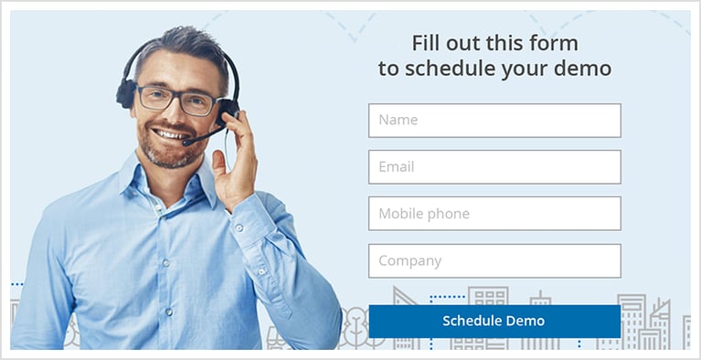
Users want to know what’s going to happen when they finish your web form and submit their information. Adding scheduling gives form fillers an incentive to provide their information. Be specific about what will happen when users click that button with phrases like “Schedule My Demo,” “Get My Free Consultation,” and others.
9. Connect forms strategically
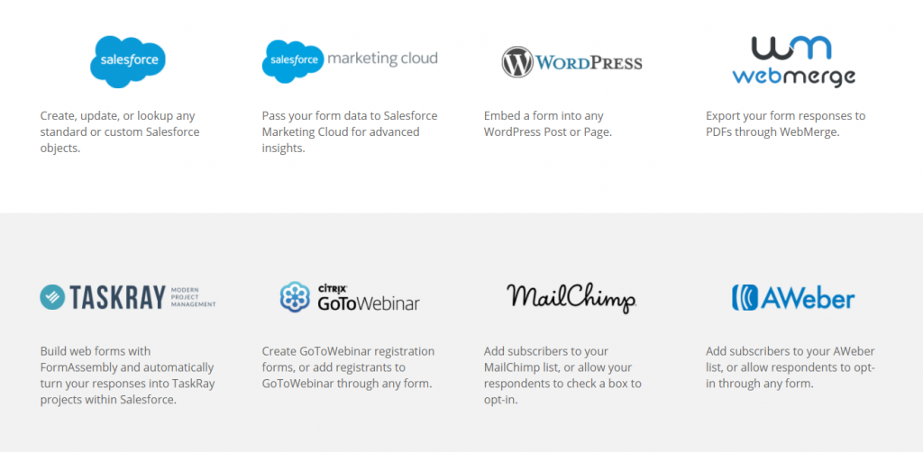
What you do with the information you collect with web forms is just as important as how you collect it. If you use Salesforce, find a web form solution that connects data automatically with Salesforce. If your sales cycle naturally leads to a meeting with your reps, allow your users to schedule that meeting right after they enter their information. If you want to add form fillers to an email list and send them your monthly newsletter, use a solution that integrates with popular tools like Mailchimp or Pardot.

(Source)
Building a great web form is key in successfully generating leads. When you follow these tips, your form conversion rates will skyrocket, leading to more meetings with serious leads. Leads will essentially qualify themselves and meetings will flow seamlessly into your calendar.
Want to learn more about creating engaging web forms? Watch our webinar, cohosted by ScheduleOnce and FormAssembly, to learn how to make your forms more effective and engaging with online scheduling.
Need a web form solution? Try FormAssembly and see why 4,000+ organizations trust their app for data collection.
This is a guest post by FormAssembly. FormAssembly is an enterprise web form solution built to help teams streamline complex processes and drive quality form conversions. Learn more on the FormAssembly website.
Better scheduling starts here
No credit card required
